


This Gatsby post was written for Gatsby 3 and is no longer maintained. If you would like to try out SvelteKit or Astro, check out the maintained posts which are based on those. Astro lets you continue to use React but also with partial hydration which can be used to provide an enhanced user experience. SvelteKit offers server side rendering as well as static site generation. See the post on how performance improved switching from Gatsby to Astro for more background.
😕 Why Build a CSS only Carousel in Gatsby? #
Let's build a CSS only Carousel in Gatsby. We are going to add a slider which stops at discrete positions (snap feature). As well as that, we will give it a little flip animation. We will do all of that using CSS. On top, we take the new Gatsby Image Plugin out for a spin.
Why build a CSS only Carousel in Gatsby? I thought this might be something interesting for anyone new to Gatsby and React, but with some web development experience with other technologies. Although there is nothing to fear in React, this guide will help you ease into React. However, even if you are already a Gatsby pro and can code this all up using advanced React features, you might appreciate the opportunity to step back and simplify your Gatsby logic, letting CSS do some heavy lifting and hopefully make the page more efficient.
The carousel is such a useful pattern to add to your toolkit. It's probably best known for its use on online stores, letting you flip through a catalogue of products. It is not only useful for e-commerce sites, though. Even if a package like flickity is your current first choice for an image gallery slider. A CSS only carousel is an alternative which doesn't need extra dependencies. Basically, the pattern can be used anywhere where you have a number of items you want to present using a limit screen footprint.
🧱 What are we Building? #
We will use a carousel to showcase recent projects on the home page of an MDX photography blog. The smooth-sliding carousel serves up a hero image for each project. On hover (or tap for mobile), a nice flip animation reveals some project details. We do all of that in CSS, using gatsby-image-plugin for the responsive images. Here's a short video of our CSS only carousel in action:
Please enable JavaScript to watch the video 📼
🔧 What Tools are we Using #
- Gatsby v3 : to make the site blazing fast.
- gatsby-plugin-image : optimal image sizing, plus automatically generated AVIF and WebP images.
- gatsby-starter-climate : this gives us a minimal Gatsby v3 MDX blog site to add the carousel to. It also saves us having to write a bit of boilerplate code.
🖥 CSS only Carousel in Gatsby: Let’s get Cracking #
To speed things up, we’ll use a Gatsby 3 MDX Blog starter . To begin, clone the repo from GitHub and fire up Gatsby from the terminal:
gatsby new css-only-carousel https://github.com/rodneylab/gatsby-starter-climatecd css-only-carouselcp .env.EXAMPLE .env.developmentcp .env.EXAMPLE .env.productiongatsby develop
Have a quick look through the folders just to get used to the setup. Once you
have a feel for it, we'll carry on. OK, let’s do this! We'll warm up
with some Gatsby before getting into the CSS. Create a new Projects component in src/components/Projects.jsx:
1 import React from 'react';2 import { GatsbyImage, getImage } from 'gatsby-plugin-image';3 import { graphql } from 'gatsby';4 import PropTypes from 'prop-types';5 6 import {7 cardContainer,8 cardContent,9 detailText,10 detailTextShort,11 icon,12 image,13 overlayText,14 slide,15 slideContainer,16 slideFront,17 slideBack,18 slideBackContent,19 slider,20 sliderShortcut,21 sliderShortcutActive,22 sliderShortcuts,23 slides,24 } from './Projects.module.scss';25 26 import { FilmIcon, SettingsIcon, ThermometerIcon } from './Icons';27 28 const imageAltText = [29 'Photograph of analogue camera which is disassembled with its components arranged on a table. There is a magnifying glass above the centre of the image',30 'Photograph of a roll of 35mm camera film centred on a large yellow background',31 'Photograph of an analogue film camera placed in front of an arrangement of film processing chemical bottles of different shapes and size as well as beakers, measuring cylinders and other photo lab equipment',32 ];33 const projectTitles = ['Classic Camera Repair', 'Film Exchange Programme', 'Film Lab'];34 35 const ProjectDetail = ({ index }) => {36 if (index === 0) {37 return (38 <div className={slideBackContent}>39 <h2>{projectTitles[0]}</h2>40 <span className={icon}>41 <SettingsIcon size="48" />42 </span>43 <p className={detailTextShort}>I rescue and repair unloved analogue cameras.</p>44 <p className={detailText}>45 I fix analogue film cameras whenever I find the time. Get in touch if you have an unloved46 film camera, no matter what condition it is in. I can use the spare parts to get another47 camera working.48 </p>49 </div>50 );51 }52 if (index === 1) {53 return (54 <div className={slideBackContent}>55 <h2>{projectTitles[1]}</h2>56 <span className={icon}>57 <FilmIcon size="48" />58 </span>59 <p className={detailTextShort}>60 Find someone who has a film you want and exchange it for one they want.61 </p>62 <p className={detailText}>63 Sometimes you want to try out a film but it’s difficult to get hold of it where you64 live. I can pair you up with someone in a another part of the world who either has or can65 source the film for you. You just exchange it for film which they are looking for.66 </p>67 </div>68 );69 }70 return (71 <div className={slideBackContent}>72 <h2>{projectTitles[2]}</h2>73 <span className={icon}>74 <ThermometerIcon size="48" />75 </span>76 <p className={detailTextShort}>77 I’m rediscovering a rare, forgotten photographic printing process every month.78 </p>79 <p className={detailText}>80 I’m trying out a different, forgotten film processing technique every month this year.81 So far I have tried Kallitype, Platinum and Palladium printing, and the Wet-Plate Collodion82 Process. What other rare processes should I try?83 </p>84 </div>85 );86 };87 88 ProjectDetail.propTypes = {89 index: PropTypes.number.isRequired,90 };91 92 const Projects = ({ carouselImages }) => (93 <section>94 <h2>My Latest Projects</h2>95 {carouselImages.map((element, index) => (96 <div key={element.id} id={`A;slide-${index}`A;}>97 <GatsbyImage98 className={image}99 image={getImage(element)}100 alt={imageAltText[index]}101 width={672}102 height={448}103 />104 </div>105 ))}106 </section>107 );108 109 Projects.propTypes = {110 carouselImages: PropTypes.arrayOf(111 PropTypes.shape({112 id: PropTypes.string,113 }),114 ).isRequired,115 };116 117 export const carouselQuery = graphql`A;118 fragment ProjectCarouselFragment on File {119 id120 childImageSharp {121 gatsbyImageData(122 width: 672123 layout: CONSTRAINED124 sizes: "(max-width: 672px) calc(100vw - 64px), 672px"125 )126 }127 }128 `A;;129 130 export const query = graphql`A;131 fragment ProjectsFragment on Query {132 projectImage1: file(relativePath: { eq: "camera-restoration-project.jpg" }) {133 ...ProjectCarouselFragment134 }135 projectImage2: file(relativePath: { eq: "film-exchange-project.jpg" }) {136 ...ProjectCarouselFragment137 }138 projectImage3: file(relativePath: { eq: "film-lab-project.jpg" }) {139 ...ProjectCarouselFragment140 }141 }142 `A;;143 144 export { Projects as default };
This is a basic shell for the component. We need to define a few bits and
pieces before we wire it up. First, though, let's have a quick look at the
GraphQL queries. In lines 98 – 110 we define a fragment
which we can use on any page we place the component on. We'll see that later. You'll
note it includes another fragment — the ProjectCarouselFragment — no fewer than three times! This illustrates one practical use of fragments.
You can see that fragment's code above. Its body is eight lines long. Defining the
fragment once and then referencing it when we need it saves us writing those eight
lines over and over. On top, if we need to change anything in the query we just
change it once, so the code is more robust using fragments. You can learn more about Gatsby GraphQL Fragments in the Gatsby docs .
Gatsby Plugin Image #
The ProjectCarouselFragment uses the new Gatsby
Image Plugin API. This creates an image object from the file. In the component body
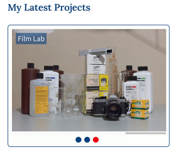
(lines 97–103) we will render the image. Note the inclusion of width and height attributes. Generally this is best
practice as it gives the user's browser an earlier indication of the image aspect
ratio. Including these can help reduce cumulative layout shift as the page loads. You will need to download three images (camera-restoration-project.jpg , film-lab-project.jpg and film-exchange-project.jpg ) and save them to a new folder: src/images.
I downsized the images and optimized them locally before uploading, so they are ready for you to use. Even though gatsby-plugin-image can optimize images, it is best practice to do some work yourself. This reduces the size of your repo and also speeds up site build. The images are 1344 pixels wide, this is double the widest display width needed. I use double because of the way Retina works. Some stock images are huge, so be sure to downsize before using them.
There are some defaults for gatsby-pluin-image already set in gatsby-config.js (lines 92 – 113). This saves us
having to repeat them in each GraphQL query.
Gatsby Config #
To be able to access the images in the GraphQL query, we need to update our gatsby-config.js file:
123 'gatsby-plugin-react-helmet',124 {125 resolve: 'gatsby-source-filesystem',126 options: {127 name: 'blog',128 path: `${__dirname}/content/blog`,129 },130 },131 {132 resolve: 'gatsby-source-filesystem',133 options: {134 name: 'images',135 path: `${__dirname}/src/images`,136 },137 },138 {139 resolve: 'gatsby-plugin-mdx',140 // TRUNCATED...141 }
Next, let’s start an SCSS file for the Project component:
@import '../styles/styles.scss';
Extra Icons #
Then, finally, we add some missing icons to src/components/Icons.jsx. Add these to the existing icons:
export const FilmIcon = ({ size = '16' }) => ( <span role="img" aria-label="film"> <FeatherIcon icon="film" size={size} /> </span>); export const SettingsIcon = ({ size = '16' }) => ( <span role="img" aria-label="settings"> <FeatherIcon icon="settings" size={size} /> </span>); export const ThermometerIcon = ({ size = '16' }) => ( <span role="img" aria-label="thermometer"> <FeatherIcon icon="thermometer" size={size} /> </span>);
Fire it up #
We should now be able to get the component rendered to the home page, once we
wire it up. Edit src/pages/index.jsx:
1 import React from 'react';2 import { graphql } from 'gatsby';3 import PropTypes from 'prop-types';4 5 import BlogRoll from '../components/BlogRoll';6 import Card from '../components/Card';7 import Projects from '../components/Projects';8 import { PureLayout as Layout } from '../components/Layout';9 import { PureSEO as SEO } from '../components/SEO';10 11 export default function Home({ data }) {12 const { projectImage1, projectImage2, projectImage3 } = data;13 const projectCarouselImages = [projectImage1, projectImage2, projectImage3];14 15 return (16 <>17 <SEO data={data} title="Home" />18 <Layout data={data}>19 <>20 <header>21 <h1>Climate — Gatsby 3 Starter</h1>22 <h2>Gatsby 3 Starter for MDX Blog Sites</h2>23 </header>24 <Card>25 <h2>About me</h2>26 <p>27 I live and breathe analogue photography. I show you my favourite analogue film cameras28 on this site. Hopefully if you are not into analogue photography yet, some of my29 enthusiasm will rub off onto you.30 </p>31 </Card>32 <Projects carouselImages={projectCarouselImages} />33 <BlogRoll />34 </>35 </Layout>36 </>37 );38 }39 40 Home.propTypes = {41 data: PropTypes.shape({42 site: PropTypes.shape({43 buildTime: PropTypes.string,44 }),45 projectImage1: PropTypes.shape.isRequired,46 projectImage2: PropTypes.shape.isRequired,47 projectImage3: PropTypes.shape.isRequired,48 }).isRequired,49 };50 51 export const query = graphql`A;52 query Home {53 site {54 ...LayoutFragment55 ...SEOFragment56 }57 ...BlogRollFragment58 ...ProjectsFragment59 }60 `A;;
There's nothing fancy here, I think it's self-explanatory, but let me know if
it is not. Just note, we have used the ProjectsFragment defined earlier. It was not at all necessary to use a fragment. I just wanted
to show that fragments can be used outside the files they are defined in. As an
aside, with Gatsby v3, you can now use fragments in GraphiQL.
If you have Gatsby running in develop mode, you should now have the component rendered on the home page. The images aren't in a carousel yet, but that will come next.
CSS only Carousel in Gatsby: Styling Time #
This is supposed to be a CSS only carousel in Gatsby, so let’s break out the CSS. Just before that, we will update the Projects component. We'll put all the CSS classes in now, so we can see the page blossom as we crank out the CSS.
1 import React from 'react';2 import { GatsbyImage, getImage } from 'gatsby-plugin-image';3 import { graphql } from 'gatsby';4 import PropTypes from 'prop-types';5 6 import {7 cardContainer,8 cardContent,9 detailText,10 detailTextShort,11 icon,12 image,13 overlayText,14 slide,15 slideContainer,16 slideFront,17 slideBack,18 slideBackContent,19 slider,20 sliderShortcut,21 sliderShortcutActive,22 sliderShortcuts,23 slides,24 } from './Projects.module.scss';25 import { isBrowser } from '../utilities/utilities';26 import { FilmIcon, SettingsIcon, ThermometerIcon } from './Icons';27 28 const imageAltText = [29 'Photograph of analogue camera which is disassembled with its components arranged on a table. There is a magnifying glass above the centre of the image',30 'Photograph of a roll of 35mm camera film centred on a large yellow background',31 'Photograph of an analogue film camera placed in front of an arrangement of film processing chemical bottles of different shapes and size as well as beakers, measuring cylinders and other photo lab equipment',32 ];33 const projectTitles = ['Classic Camera Repair', 'Film Exchange Programme', 'Film Lab'];34 35 const ProjectDetail = ({ index }) => {36 if (index === 0) {37 return (38 <div className={slideBackContent}>39 <h2>{projectTitles[0]}</h2>40 <span className={icon}>41 <SettingsIcon size="48" />42 </span>43 <p className={detailTextShort}>I rescue and repair unloved analogue cameras.</p>44 <p className={detailText}>45 I fix analogue film cameras whenever I find the time. Get in touch if you have an unloved46 film camera, no matter what condition it is in. I can use the spare parts to get another47 camera working.48 </p>49 </div>50 );51 }52 if (index === 1) {53 return (54 <div className={slideBackContent}>55 <h2>{projectTitles[1]}</h2>56 <span className={icon}>57 <FilmIcon size="48" />58 </span>59 <p className={detailTextShort}>60 Find someone who has a film you want and exchange it for one they want.61 </p>62 <p className={detailText}>63 Sometimes you want to try out a film but it’s difficult to get hold of it where you64 live. I can pair you up with someone in a another part of the world who either has or can65 source the film for you. You just exchange it for film which they are looking for.66 </p>67 </div>68 );69 }70 return (71 <div className={slideBackContent}>72 <h2>{projectTitles[2]}</h2>73 <span className={icon}>74 <ThermometerIcon size="48" />75 </span>76 <p className={detailTextShort}>77 I’m rediscovering a rare, forgotten photographic printing process every month.78 </p>79 <p className={detailText}>80 I’m trying out a different, forgotten film processing technique every month this year.81 So far I have tried Kallitype, Platinum and Palladium printing, and the Wet-Plate Collodion82 Process. What other rare processes should I try?83 </p>84 </div>85 );86 };87 88 ProjectDetail.propTypes = {89 index: PropTypes.number.isRequired,90 };91 92 const Projects = ({ carouselImages }) => {93 let currentCarouselIndex = 0;94 if (isBrowser) {95 const { hash } = window.location;96 const regularExpression = /slide-\d/;97 if (regularExpression.test(hash)) {98 currentCarouselIndex = parseInt(hash.slice(7), 10);99 }100 }101 102 return (103 <section>104 <h2>My Latest Projects</h2>105 <div className={cardContainer}>106 <div className={cardContent}>107 <div className={slider}>108 {/* eslint-disable-next-line jsx-a11y/no-noninteractive-tabindex */}109 <div className={slides} tabIndex="0">110 {carouselImages.map((element, index) => (111 <div112 aria-selected={currentCarouselIndex === index}113 className={slideContainer}114 key={element.id}115 id={`A;slide-${index}`A;}116 >117 <div className={slide}>118 <div className={slideFront}>119 <GatsbyImage120 className={image}121 image={getImage(element)}122 alt={imageAltText[index]}123 width={672}124 height={448}125 />126 <div className={overlayText}>{projectTitles[index]}</div>127 </div>128 <div className={slideBack}>129 <ProjectDetail index={index} />130 </div>131 </div>132 </div>133 ))}134 </div>135 </div>136 <div className={sliderShortcuts}>137 {carouselImages.map((element, index) => (138 <a139 aria-label={`A;Skip to ${projectTitles[index]} project`A;}140 aria-current={currentCarouselIndex === index}141 className={`A;${sliderShortcut} ${142 currentCarouselIndex === index ? sliderShortcutActive : ''143 }`A;}144 href={`A;#slide-${index}`A;}145 key={`A;link-${element.id}`A;}146 >147 <span className="screen-reader-text">{index + 1}</span>148 </a>149 ))}150 </div>151 </div>152 </div>153 </section>154 );155 };156 // TRUNCATED...
I have added a bit of new code here, so let's run through the logic. I have
based the implementation off a Chris Coyier post written to show how far HTML and CSS can take you . You might have noticed before that each of the images was given an id tag on their parent element. Interestingly, even if the images are in a carousel,
we can jump to any image and have it show, front and centre in the carousel using
default browser behaviour. See the post on using Scroll to Anchor for some background on how IDs and hashes work
together.
The logic in lines 92 – 100 gets the current hash
from the browser window location. We need this because we are not using React to
track the carousel's state. We have a check that the code is running in a browser
(and not on the server as it does during build). Without this check, we will run
the site fine in develop mode, but get errors when we try to build. As this check
is something that might be needed in other components, we will define it in a utilities
file later.
Accessibility #
There are a few accessibility attributes to improve user experience. The tabIndex in line 109 allows users to focus the carousel by tabbing to it. Once focussed,
users can scroll through carousel slides using the keyboard. I learned about aria-current (line 135) from the University of Twitter via a Wes Bos question answered by
Scott Vinkle. It is used here on the dots below the carousel. There is a visual
indication of which slide is selected (red, instead of blue dot), aria-current is used to communicate that message
to assistive technology .
Just before we go on to flesh out the CSS, we should define our isBrowser utility function, which we mentioned previously. Create a new utilities folder in /src and add a utilities.js file to it:
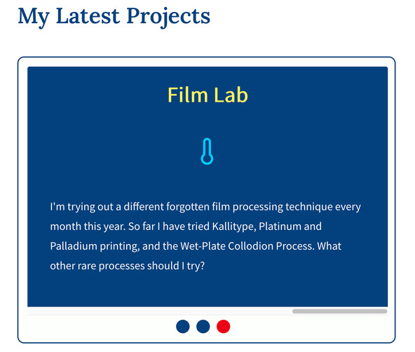
1 export const isBrowser = typeof window !== 'undefined';
CSS only Carousel in Gatsby: CSS Time #
Finally, it's time to put the CSS into our CSS only carousel in Gatsby. We will do this in three phases:
- carousel slider with animation;
- flip animation; and
- add responsive support.
If you are short on time, just paste the three main chunks of highlighted code below, one after the other, into your editor (ignore the short alternative implementation block).
CSS only Carousel in Gatsby: Carousel Slider and Animation #
Add the code below to src/components/Projects.module.scss to add the carousel animations.
1 @import '../styles/styles.scss';2 3 html {4 scroll-behavior: smooth;5 scroll-padding-top: $spacing-32;6 }7 8 $image-width: calc(#{$desktop-breakpoint - (2 * $spacing-4)});9 $image-height: calc(#{$image-width / 1.5});10 11 .card-container {12 display: flex;13 width: 100%;14 }15 16 .card-content {17 width: 100%;18 border: $spacing-px-2 solid $color-theme-4;19 background-color: $color-accent;20 border-radius: $spacing-3;21 margin: $spacing-6 auto;22 padding: $spacing-4;23 24 h2 {25 margin: $spacing-0 $spacing-2;26 }27 p {28 font-size: $font-size-1;29 margin: $spacing-2;30 }31 }32 33 .slider {34 width: $image-width;35 text-align: center;36 overflow: hidden;37 }38 39 .slides {40 display: flex;41 overflow-x: auto;42 overflow-y: hidden;43 scroll-snap-type: x mandatory;44 scroll-behavior: smooth;45 -webkit-overflow-scrolling: touch;46 47 background-color: $color-theme-4; // this is visible in space between slides on scroll48 perspective: 1200;49 border-radius: $spacing-1;50 }51 52 .slides::-webkit-scrollbar {53 width: $spacing-3;54 height: $spacing-3;55 }56 .slides::-webkit-scrollbar-thumb {57 background: $color-theme-4;58 border-radius: $spacing-3;59 }60 .slides::-webkit-scrollbar-track {61 background: $color-theme-3;62 }63 64 .slide-container {65 scroll-snap-align: start;66 flex-shrink: 0;67 width: $image-width;68 height: $image-height;69 margin-right: $spacing-16; // this is the space between slides (visible during scroll)70 background: $color-theme-4;71 transform-origin: center center;72 transform: scale(1);73 transition: transform 0.5s;74 position: relative;75 76 display: flex;77 justify-content: center;78 align-items: center;79 font-size: $spacing-24;80 }81 82 .slider-shortcuts {83 display: flex;84 justify-content: center;85 }86 87 .slider-shortcut {88 display: inline-flex;89 width: $spacing-6;90 height: $spacing-6;91 background: $color-theme-4;92 text-decoration: none;93 align-items: center;94 justify-content: center;95 border-radius: 50%;96 margin: $spacing-2 $spacing-3 $spacing-0 $spacing-0;97 position: relative;98 font-weight: $font-weight-bold;99 }100 101 .slider-shortcut-active {102 background: $color-theme-1;103 }104 105 .slider-shortcut:active {106 top: 1px;107 background-color: $color-theme-3;108 }109 .slider-shortcut:focus {110 background: $color-theme-3;111 }112 113 .image {114 border-radius: $spacing-1;115 }116 117 .overlay-text {118 display: inline;119 position: absolute;120 top: $spacing-4;121 left: $spacing-4;122 background: rgba($color: $color-theme-4, $alpha: 0.6);123 color: $color-accent;124 padding: $spacing-0 $spacing-2;125 font-size: $font-size-4;126 }
Now you should have something which looks more like a carousel. If you click a blue dot below the image, you should trigger a slide transition. Look in your browser address bar, and you will see a hash has been tacked on the end of the address.
CSS only Carousel in Gatsby: What Have we Got Here? #
A few things to note in the CSS. We set smooth scrolling in line 3. This
improves the UX. Motion is slow, so it’s probably not necessary to
consider coding up a prefers-reduced-motion alternative.
The scroll-padding-top setting in the next line
helps make sure the entire slide is visible when the user clicks one of the dots.
There is an alternative, which was not working in this case in Chrome or Safari,
but did work in Firefox:
64 .slide-container {65 scroll-margin-top: $spacing-32; // alternative implementation66 scroll-snap-align: start;67 flex-shrink: 0;68 // TRUNCATED...69 }
You might try it elsewhere, depending on your use case. It has the advantage of not having to apply the style to the entire HTML section of the DOM.
The scroll-snap-type: x mandatory in line 43 ensures
the slider stops at discrete positions which line up with the slides. This is
the behaviour in Chrome and Firefox. I would say the best way to understand what
the other lines of CSS do is to play around with them. Much customisation is possible.
When applying this code to your own site, be careful with the contrast levels
of the overlay text against the background. To maintain accessibility, you might
want to add a linear gradient over the image. I am playing around with some Rust code to check overlay text / image
contrast but this is still in its infancy.

If you’re ready, let’s move on to look at the flip animation.
CSS only Carousel in Gatsby: Slide Flip Animation #
Next, we add a flip animation to the carousel. Each project has a little
summary detail, already included in the React component (but not yet visibly
rendered). When we hover over a slide, it will flip, revealing the project
details. Add the code below to the end of src/components/Projects.module.scss to add the carousel animations.
117 .overlay-text {118 display: inline;119 position: absolute;120 top: $spacing-4;121 left: $spacing-4;122 background: rgba($color: $color-theme-4, $alpha: 0.6);123 color: $color-accent;124 padding: $spacing-0 $spacing-2;125 font-size: $font-size-4;126 }127 128 .slide {129 width: $image-width;130 height: $image-height;131 transform-style: preserve-3d;132 transition: all 0.4s ease;133 }134 135 .slide:hover {136 transform: rotateY(179.9deg);137 }138 139 // disable transition for Safari140 @media not all and (min-resolution: 0.001dpcm) {141 .slide:hover {142 transform: rotateY(0);143 }144 }145 146 .slide-front,147 .slide-back {148 color: #fff;149 position: absolute;150 backface-visibility: hidden;151 transform-style: preserve-3d;152 }153 154 .slide-back {155 transform: rotateY(179.9deg);156 border-radius: $spacing-1;157 }158 159 .slide-back-content {160 display: flex;161 flex-direction: column;162 background-color: $color-theme-4;163 padding: $spacing-6 $spacing-8;164 height: 100%;165 166 .detail-text-short {167 display: none;168 }169 170 h2,171 p {172 color: $color-theme-3;173 }174 h2 {175 font-size: $font-size-5;176 font-family: $font-body;177 color: $color-theme-3;178 }179 p {180 font-size: $font-size-2;181 color: $color-accent;182 text-align: left;183 }184 185 .icon {186 color: $color-theme-2;187 font-size: $font-size-7;188 padding: $spacing-8 $spacing-0 $spacing-6;189 }190 }191 192 @supports (scroll-snap-type) {193 .slider-shortcut {194 display: none;195 }196 }
Let me know if there is anything in there I should add an explanation for.
This flip animation is not rendering correctly in Safari at the moment, so I
have included some CSS to disable the flip on hover (lines 140 – 144), just for
Safari. The block at the end is kind of related to the carousel styling, it
hides the dots where scroll-snap-type is not supported.

CSS only Carousel in Gatsby: Mobile Friendly #
The last bit is probably the most important. We add a little CSS to make
sure the code is responsive and mobile users have fantastic UX too. Update
the code in src/components/Projects.module.scss to match this:
192 @supports (scroll-snap-type) {193 .slider-shortcut {194 display: none;195 }196 }197 198 @media screen and (max-width: $desktop-breakpoint) {199 .slider {200 margin-left: auto;201 margin-right: auto;202 width: 320px;203 }204 205 .slide-container {206 width: 320px;207 height: 213px;208 }209 210 .slide {211 width: 320px;212 height: 213px;213 }214 215 .overlay-text {216 font-size: $font-size-1;217 }218 219 .slide-back-content {220 padding: $spacing-4 $spacing-2;221 h2,222 .icon {223 display: none;224 }225 226 .detail-text {227 display: none;228 }229 230 .detail-text-short {231 display: flex;232 }233 }234 }235 236 @media screen and (max-width: $max-width-sm) {237 .slider {238 width: 256px;239 }240 241 .slide-container {242 width: 256px;243 height: 170px;244 }245 246 .slide {247 width: 256px;248 height: 170px;249 }250 }
Mission Accomplished! #
That's it! What do you think of the CSS only carousel in Gatsby? I think this is the first component I have coded where there are more lines of CSS code than JSX 😀. It started out as a much shorter post, but I wanted to flesh it out to a fully featured, real-world example, so it would have more practical use. Thanks for following all the way through to the end 🙏🏽.
Share your own CSS only carousel in Gatsby implementation on Twitter. Use
the #askRodney hashtag, so you can find other
coders' work too.
🙏🏽 Feedback #
How did you find this guide? What extensions do you want to implement on your CSS only carousel in Gatsby? Let me know if I should do a follow-up post on using React to mirror the carousel state. If you do this, you can synchronize elements outside the slider. As an example, scroll down to the bottom of this page to the “Similar Posts” block. You will see that if you scroll, the orange dot indicator tracks the current slide (this only works in reverse, i.e. click dot and slide changes in the CSS only version). On top, the post title shortcuts are synchronized. I will write a post on how to build that extra level of interaction if you are interested.
Have you found this post useful? I do hope it was easy enough to follow. Please let me know in any case. I would love to know your thoughts on the starter. Did it save you a bit of time by not having, firstly, to code a whole website from scratch to try out this code? Was it easy to download and start with Gatsby v3? Also, get in touch if you have ideas for posts showing other new Gatsby v3 features. If you have found this post useful and can afford even a small contribution, please consider supporting me through Buy me a Coffee.
Finally, feel free to share the post on your social media accounts for all your followers who will find it useful. You can get in touch via @askRodney on Twitter and also askRodney on Telegram . Also, see further ways to get in touch with Rodney Lab. We post regularly on online privacy and security, as well as Gatsby v3. Also, subscribe to the newsletter to keep up-to-date with our latest projects.